
Magazine makeover!
Company overview
Since the '90s, TopaTeam has been successfully supporting the carpentry scene, boosting craftsmen with one-of-a-kind partnerships. The concept? Blend artisanal mastery with top-notch products for unique interior solutions. They're not just about wood – think healthy sleep systems, high-end kitchen gear, and bespoke bio sauna systems. Always adapting to market vibes, they're on a mission with their partners to fuse craftsmanship, innovation, and service, giving the carpentry industry an exceptional makeover.
Role
Art Director
Head of Marketing
Collaboration
mgo
Absatzformat

The project
The magazine "WohnSinn" is a long-standing publication, ongoing for 20 years. The magazine's target demographic is people in their second half of life, with their now grown children leaving home and plenty of time and money to spend on renovations and new additions. More than just regular store furniture, they want custom-made woodworking that fits their needs. The magazine serves as an adaptable advertising platform for numerous small and high-end carpenter boutiques, offering covers that are interchangeable and customizable.
The challenge
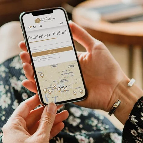
WohnSinn is expanding beyond its stand-alone magazine format and now has its own website, which includes cool features to promote regional carpenters, as well as an additional social media channel to increase its traffic. The challenge was to create a cross-media product that would leverage the benefits of each of its platforms, while also giving the print product a fresh look and feel. Take a look at the rebranding, along with its corresponding platform.
Branding ✓
Branding Guidelines ✓ Website ✓ Social Media ✓ Communication ✓


Starting point
In preparation of the "WohnSinn" project, I analyze key aspects: target audience, delivery specifics, and desired brand perception. It's vital to assess the current brand reception—initially at a glance and then through a thorough analysis. These compressions are pivotal in my workflow: the first aims to attract interest, while the latter ensures sustained engagement.
I was able to deduce the following: the magazine's design features full-colored pages, blocks of text, and a mix of multiple colors and fonts on each page. The design style appears to draw inspiration from trends popular in the 90s or early 2000s.
Work Process Breakdown


